Data Analysis and Research
The Smell Pittsburgh (Smell PGH) app has been active since September 2016. Over the past several years, residents have utilized Smell PGH to submit over 75 thousand reports (as of Dec 2022) related to pollution odors. These data offer multiple accounts of the human impacts of air pollution and provide insights into the air quality landscape of our region. Collectively, the Pittsburgh community has engaged in documenting conditions of the air and has made connections between air quality and our health. To highlight patterns and insights in the thousands of Smell PGH reports, this page outlines data analyses curated by Dr. Yen-Chia Hsu from the CREATE Lab. These assessments are based on Smell PGH data from 2017 through 2022. In the sections below, we examine these data from several different aspects in order to understand:
- Levels and types of report submissions and public engagement
- How reports are distributed over time and across neighborhoods
- Patterns in the content of reports
- Links between smell reports and pollutants in the air
Summary of Findings
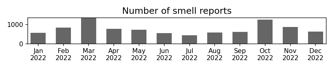
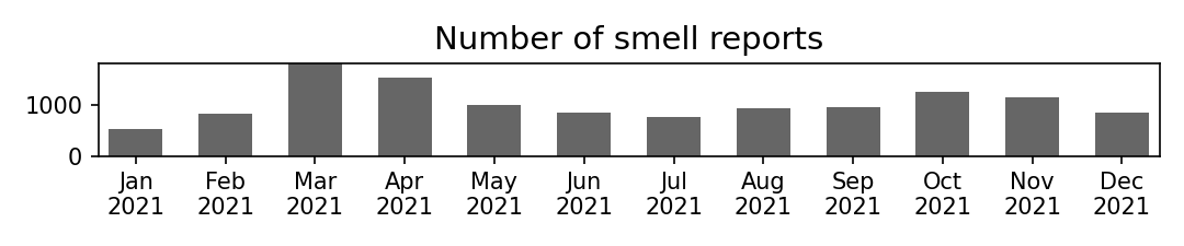
The number of reports submitted through the Smell PGH app had steadily increased from 2017 to 2020 (see Table 1). However, there has been a downward trend in app use in the past few years (see Table 2). Many residents who used the Smell PGH app were actively engaged, with 25% to 50% of users submitting more than one report in a given week and/or month. When looking at the Pittsburgh region, we saw greater engagement with the app across local zip codes over the years. Local air quality at a given time appeared to affect the level of engagement with Smell PGH, with more users interacting with the app during poor air quality conditions. The Smell PGH map, which visualizes smell reports across our region as well as local air quality data, was another significant aspect of engagement, with over 80% of app users interacting with the map.
When looking at overall submissions, most pollution odor reports (over 70% each year) were rated 3 or higher, on a scale of 1 to 5 (1 being just fine, and 5 being as bad as it gets). Smell PGH reports were primarily submitted during morning hours (especially between 7 and 10am), and were less frequent at nighttime. Most user comments described industrial pollution odors and symptoms related to air pollution exposure. Odor descriptions and symptoms were frequently linked to hydrogen sulfide, which has a "rotten egg" smell and is known to cause symptoms of headaches, dizziness, eye irritation, sore throat, cough, nausea, and shortness of breath (Reiffenstein et al., 1992; Guidotti, 2010). These narratives align with our finding that hydrogen sulfide is a significant driver of smell reports.
Using Smell PGH reports and air quality data from local monitoring stations, we developed a statistical model to predict upcoming smell events and send push notifications to inform communities. Our analysis indicated that odor pollution events in the Greater Pittsburgh region are related to the joint effect of wind directions and hydrogen sulfide readings. This research shows that engaging residents in documenting their experiences with pollution odors can help identify local air pollution patterns. The dataset and code utilized in this analysis are publicly available on GitHub. For a more in depth explanation about our approach, please refer to our research publication below:
Yen-Chia Hsu, Jennifer Cross, Paul Dille, Michael Tasota, Beatrice Dias, Randy Sargent, Ting-Hao (Kenneth) Huang, and Illah Nourbakhsh. 2020. Smell Pittsburgh: Engaging Community Citizen Science for Air Quality. ACM Transactions on Interactive Intelligent Systems. 10, 4, Article 32. DOI:https://doi.org/10.1145/3369397. Preprint:https://arxiv.org/pdf/1912.11936.pdf.
Distribution of Smell Reports and Users Over Time
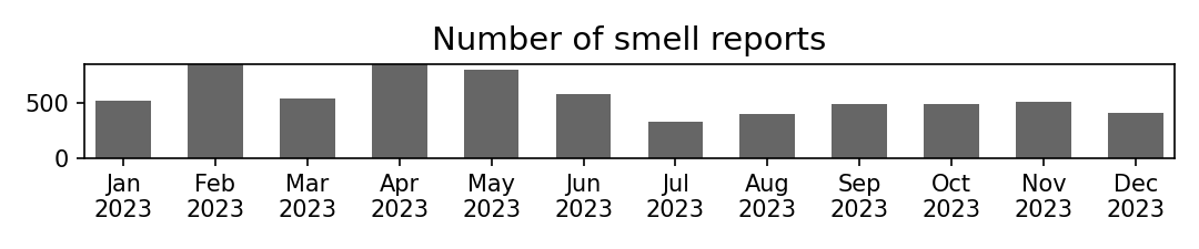
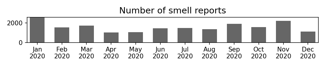
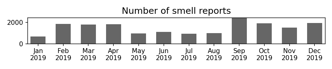
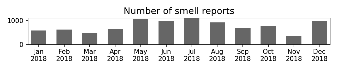
To understand user engagement over time, we aggregated the number of smell reports and unique users by month and also assessed the distribution of smell ratings by year. In general, user engagement based on the number of reports submitted was higher in 2020 than any calendar year. Each time a resident submits a smell report, they select a rating for the smell from a scale of 1 to 5 (1 being just fine, and 5 being as bad as it gets). Table 1 shows the distribution of smell reports, by year and rating. Over 70% of reports submitted since the app's inception were rated three or higher.
| Smell Rating | Description | 2025 | 2024 | 2023 | 2022 | 2021 | 2020 | 2019 | 2018 | 2017 |
|---|---|---|---|---|---|---|---|---|---|---|
| 1 | Just fine! | 187 (6.3%) | 227 (4.6%) | 323 (4.8%) | 333 (3.6%) | 707 (5.7%) | 1,565 (8.2%) | 1,711 (9.5%) | 1,199 (13.0%) | 1,658 (20.4%) |
| 2 | Barely noticeable | 122 (4.1%) | 159 (3.2%) | 254 (3.8%) | 287 (3.1%) | 447 (3.6%) | 921 (4.8%) | 798 (4.4%) | 497 (5.4%) | 665 (8.2%) |
| 3 | Definitely noticeable | 619 (20.7%) | 1,016 (20.6%) | 1,366 (20.3%) | 1,922 (20.8%) | 2,902 (23.3%) | 4,436 (23.3%) | 4,305 (23.9%) | 2,649 (28.8%) | 2,246 (27.7%) |
| 4 | It's getting pretty bad | 972 (32.6%) | 1,692 (34.3%) | 2,238 (33.3%) | 3,185 (34.5%) | 4,258 (34.2%) | 6,014 (31.6%) | 5,805 (32.3%) | 2,932 (31.9%) | 2,171 (26.8%) |
| 5 | About as bad as it gets! | 1,086 (36.4%) | 1,842 (37.3%) | 2,541 (37.8%) | 3,506 (38.0%) | 4,126 (33.2%) | 6,082 (32.0%) | 5,358 (29.8%) | 1,918 (20.9%) | 1,372 (16.9%) |
| Sum | 2,986 | 4,936 | 6,722 | 9,233 | 12,440 | 19,019 | 17,977 | 9,195 | 8,112 |
Figure 1 (shown below), further breaks down smell report submissions by month for each year.
Analysis of smell reports (2025)

Analysis of smell reports (2024)

Analysis of smell reports (2023)
Analysis of smell reports (2022)
Analysis of smell reports (2021)
Analysis of smell reports (2020)
Analysis of smell reports (2019)
Analysis of smell reports (2018)
Analysis of smell reports (2017)

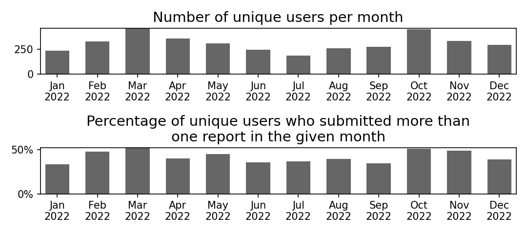
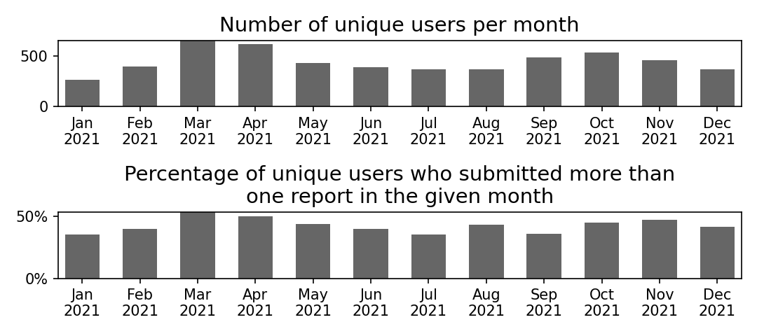
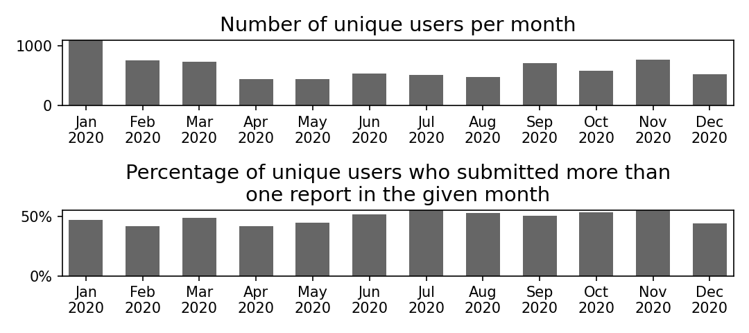
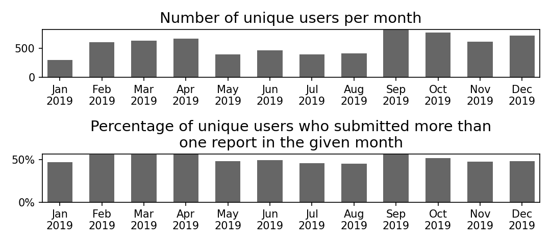
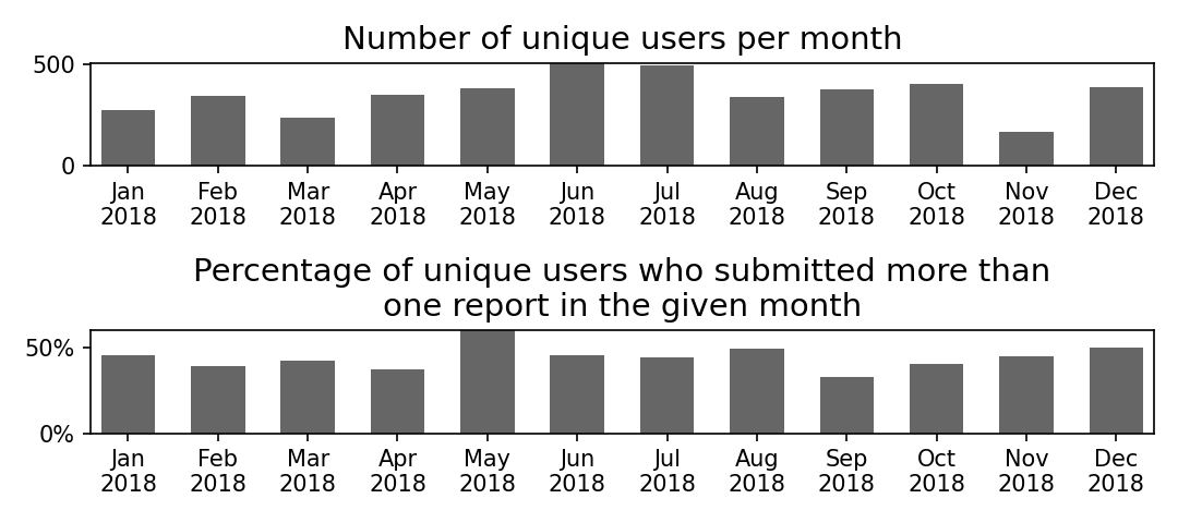
Similar to the increase in smell reports, we also saw an overall rise in the number of community members engaged with the app over the years (reported in the next section). To estimate the number of unique users, we combined the results from Google Analytics and our customized tracker in the system. It is noteworthy that almost 50% of these unique users submitted more than one report each month. Figure 2 (shown below) breaks down user engagement by month for each year.
Analysis of unique users (2022)
Analysis of unique users (2021)
Analysis of unique users (2020)
Analysis of unique users (2019)
Analysis of unique users (2018)
Analysis of unique users (2017)

We also wanted to understand how many of these community members were "actively" engaged with the app. For each report submitted, we assessed whether that same user logged another report within the previous 7 or 30 days. We then computed the total number of unique users who submitted a smell report in a given month and also submitted at least one other report 7 or 30 days before that time. This metric of "active engagement" offers insight into the proportion of users who submitted smell reports at a higher frequency. The results show that on average, about 25% - 50% of users were actively engaged with the app. Figure 3 (given below) depicts the monthly breakdown of the proportion of unique users who actively reported odors.
Analysis of active users (2022)
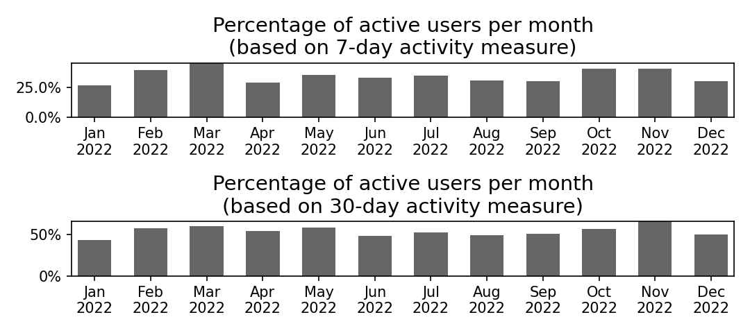
NOTE: We defined the "active users" metric by examining each report submitted in a given month, and assessing whether that same user logged another report within the previous 7 or 30 days. We then aggregated the total number of unique users who submitted a report in the given month and also submitted at least one other report in the prior 7 or 30 days. This number of active users is expressed as a proportion of the total number of unique users per month.
Analysis of active users (2021)
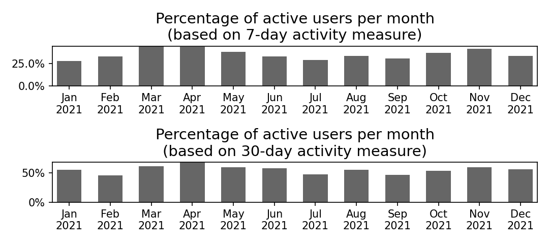
NOTE: We defined the "active users" metric by examining each report submitted in a given month, and assessing whether that same user logged another report within the previous 7 or 30 days. We then aggregated the total number of unique users who submitted a report in the given month and also submitted at least one other report in the prior 7 or 30 days. This number of active users is expressed as a proportion of the total number of unique users per month.
Analysis of active users (2020)
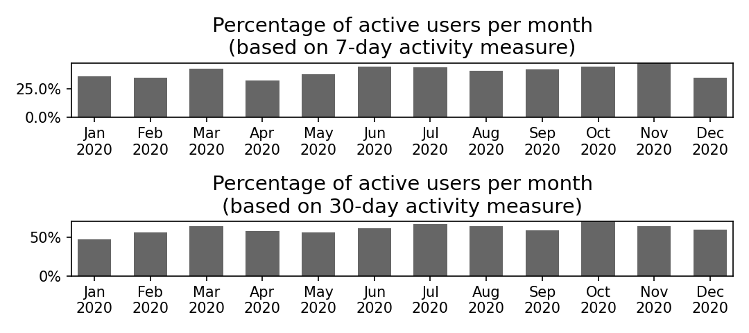
NOTE: We defined the "active users" metric by examining each report submitted in a given month, and assessing whether that same user logged another report within the previous 7 or 30 days. We then aggregated the total number of unique users who submitted a report in the given month and also submitted at least one other report in the prior 7 or 30 days. This number of active users is expressed as a proportion of the total number of unique users per month.
Analysis of active users (2019)
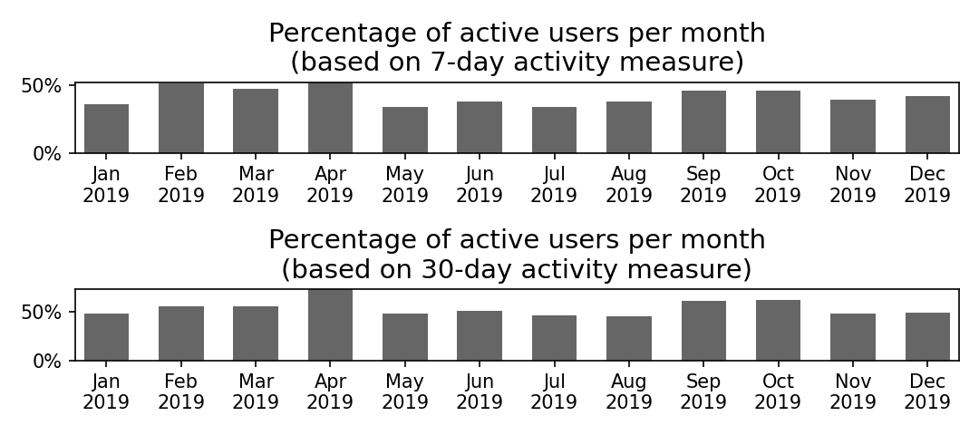
NOTE: We defined the "active users" metric by examining each report submitted in a given month, and assessing whether that same user logged another report within the previous 7 or 30 days. We then aggregated the total number of unique users who submitted a report in the given month and also submitted at least one other report in the prior 7 or 30 days. This number of active users is expressed as a proportion of the total number of unique users per month.
Analysis of active users (2018)
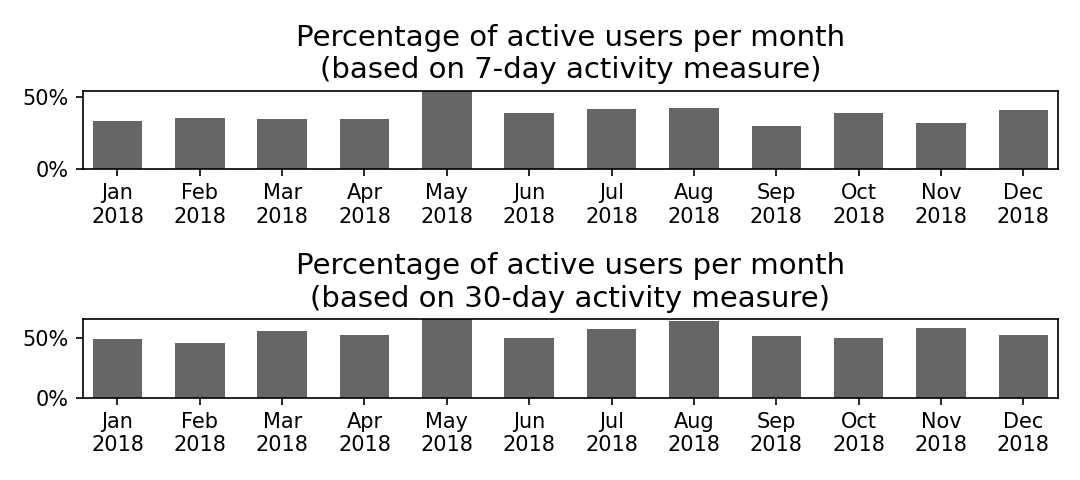
NOTE: We defined the "active users" metric by examining each report submitted in a given month, and assessing whether that same user logged another report within the previous 7 or 30 days. We then aggregated the total number of unique users who submitted a report in the given month and also submitted at least one other report in the prior 7 or 30 days. This number of active users is expressed as a proportion of the total number of unique users per month.
Analysis of active users (2017)
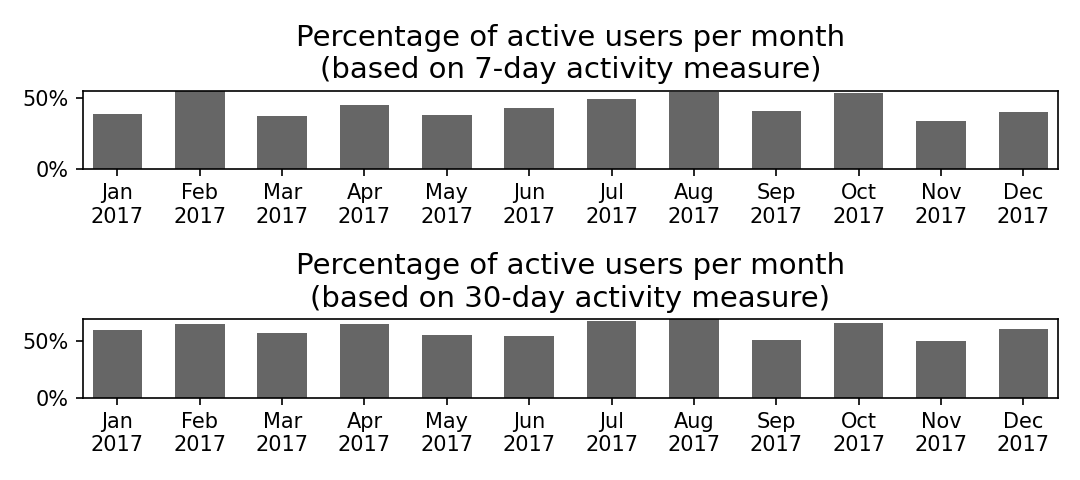
NOTE: We defined the "active users" metric by examining each report submitted in a given month, and assessing whether that same user logged another report within the previous 7 or 30 days. We then aggregated the total number of unique users who submitted a report in the given month and also submitted at least one other report in the prior 7 or 30 days. This number of active users is expressed as a proportion of the total number of unique users per month.
Analysis of User Engagement
We computed the number of unique users who submitted at least one smell report and used the map at least once, respectively (see Table 2). The number of interaction events with the map for each user was tracked anonymously using Google Analytics. The analysis from 2017-2020 shows that over 45% of our users contributed data, and over 80% of our users interacted with the map.
| Number of Unique Users | 2022 | 2021 | 2020 | 2019 | 2018 | 2017 |
|---|---|---|---|---|---|---|
| Submitted Reports | 1,242 (37.0%) | 1,804 (41.5%) | 2,688 (46.8%) | 3,274 (50.9%) | 1,769 (66.9%) | 1,308 (58.4%) |
| Used the Map | 3,054 (90.9%) | 3,919 (90.2%) | 5,227 (91.0%) | 5,708 (88.8%) | 2,248 (85.0%) | 1,949 (87.0%) |
| Participated (N) | 3,358 | 4,347 | 5,743 | 6,429 | 2,645 | 2,239 |
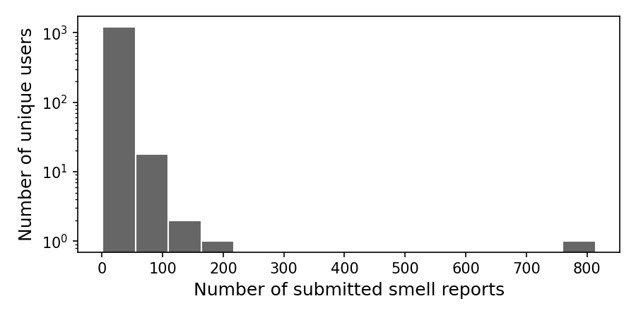
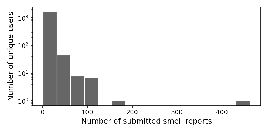
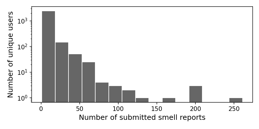
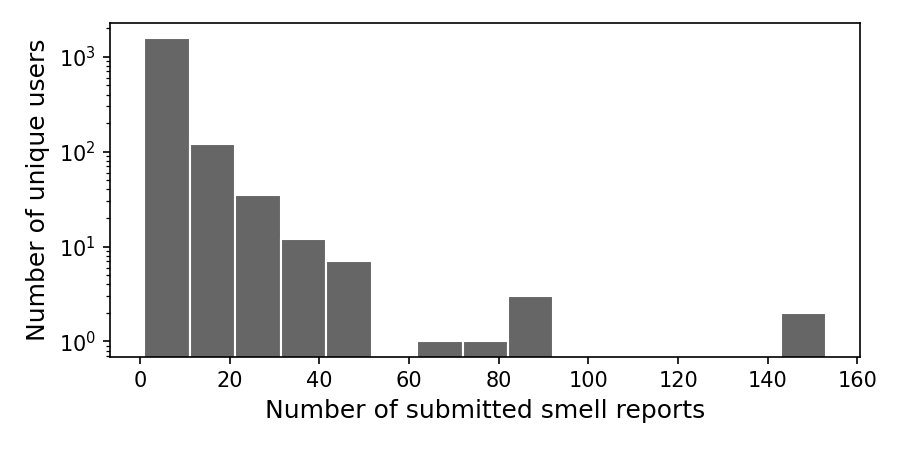
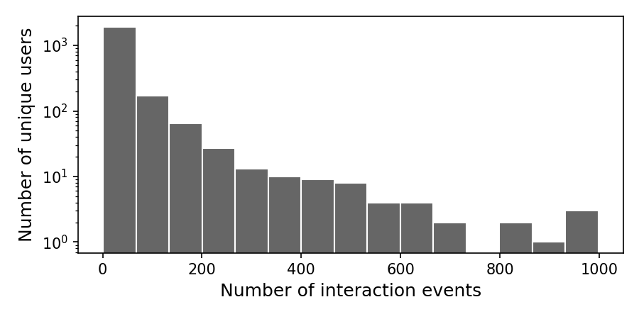
Figure 4 below shows the distribution of unique users who submitted at least one smell report, aggregated by the total number of submitted reports in a year. Most users submitted up to about 100 reports a year, while a small number reported pollution odors more frequently with some submitting over 200 reports in 2019 and 2022.
Distribution of users by the number of submitted reports (2022)
Distribution of users by the number of submitted reports (2021)
Distribution of users by the number of submitted reports (2020)
Distribution of users by the number of submitted reports (2019)

Distribution of users by the number of submitted reports (2018)
Distribution of users by the number of submitted reports (2017)
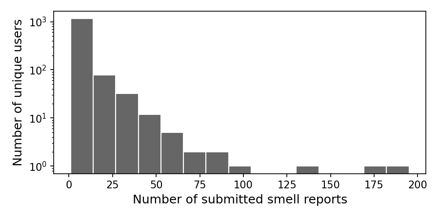
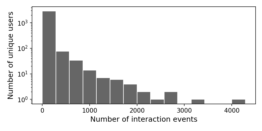
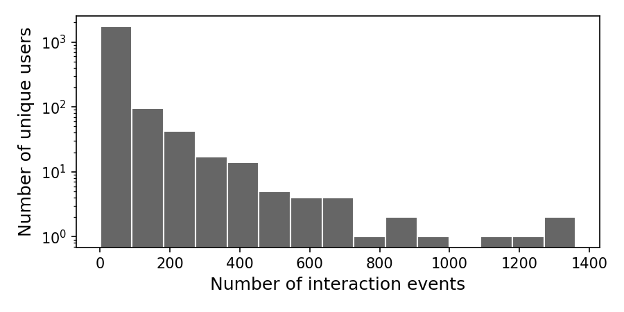
Figure 5 shows the distribution of unique users who interacted with the map at least once, aggregated by the total number of interaction events in a year. Most users interacted with the map up to about 500 times a year, while a small number were more actively engaged with the map with some logging over 6000 interactions in 2020.
Distribution of users by the number of map interaction events (2022)
Distribution of users by the number of map interaction events (2021)
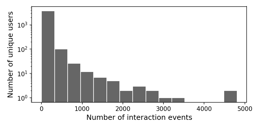
Distribution of users by the number of map interaction events (2020)
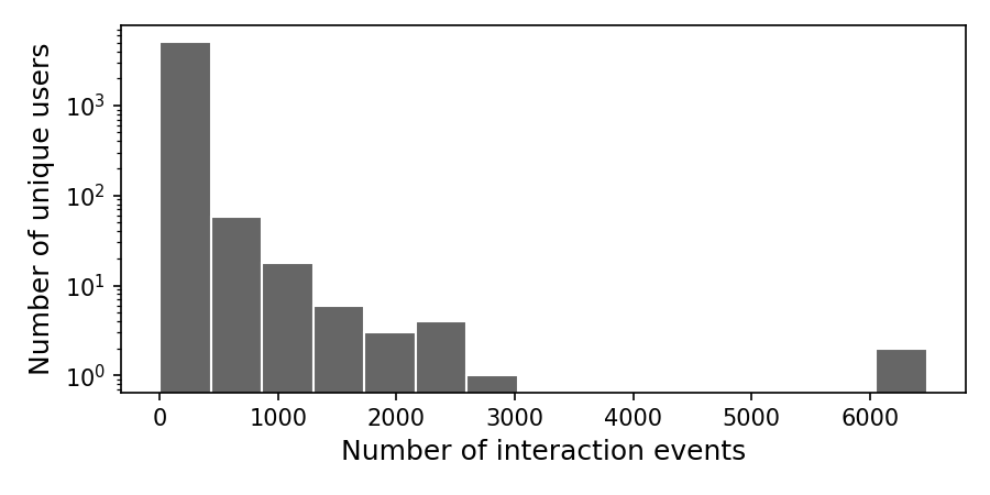
Distribution of users by the number of map interaction events (2019)
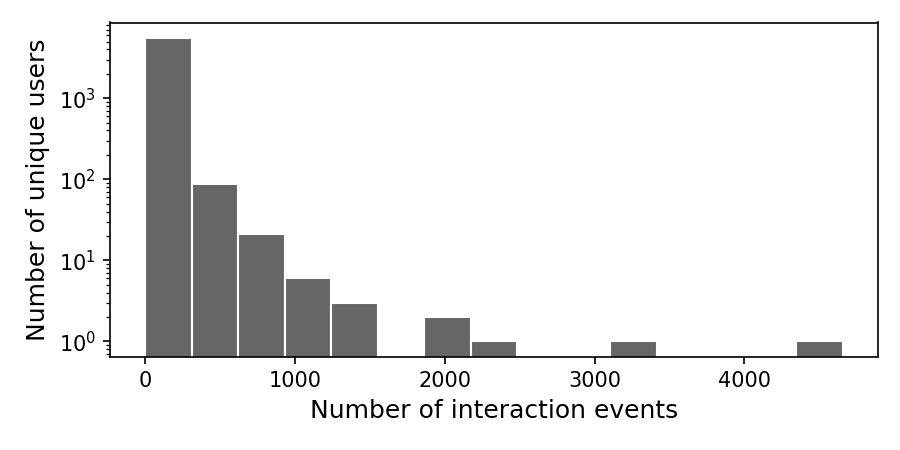
Distribution of users by the number of map interaction events (2018)
Distribution of users by the number of map interaction events (2017)
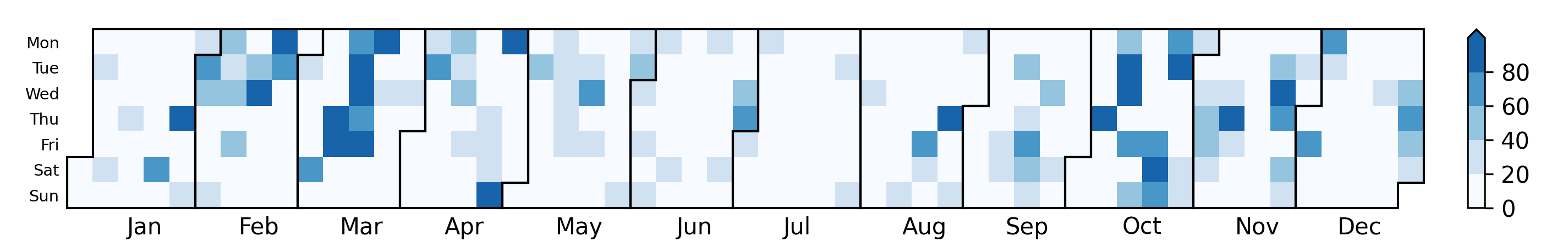
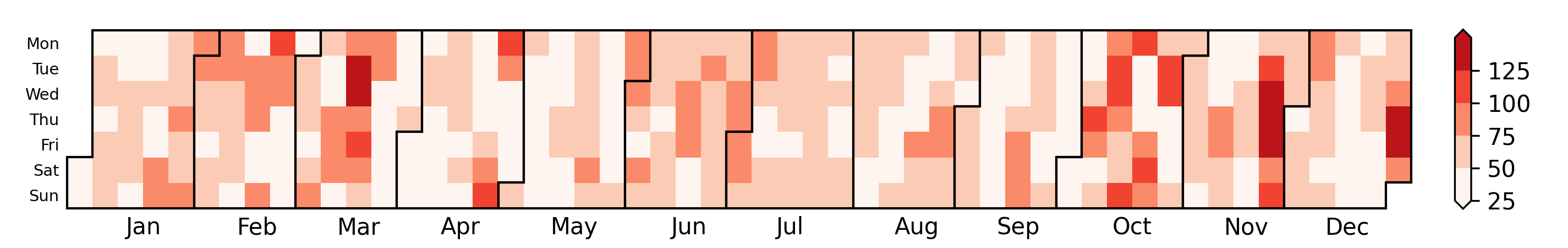
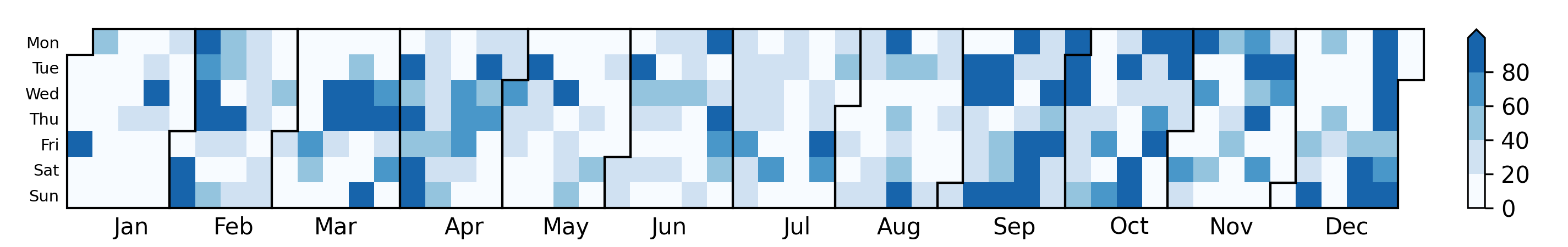
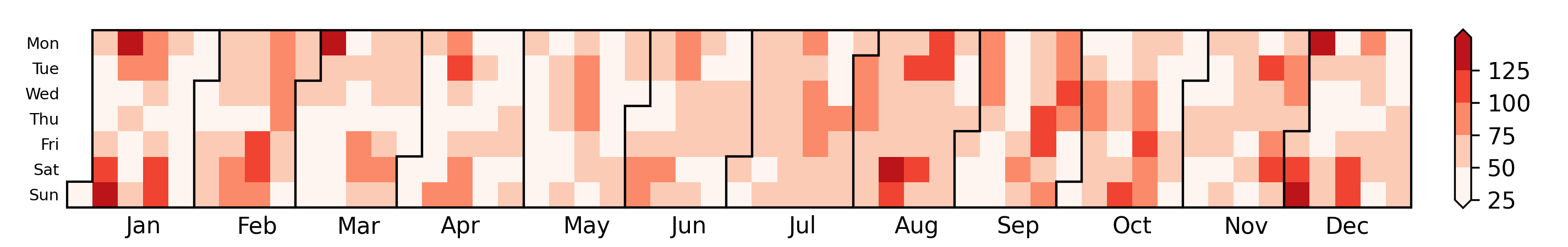
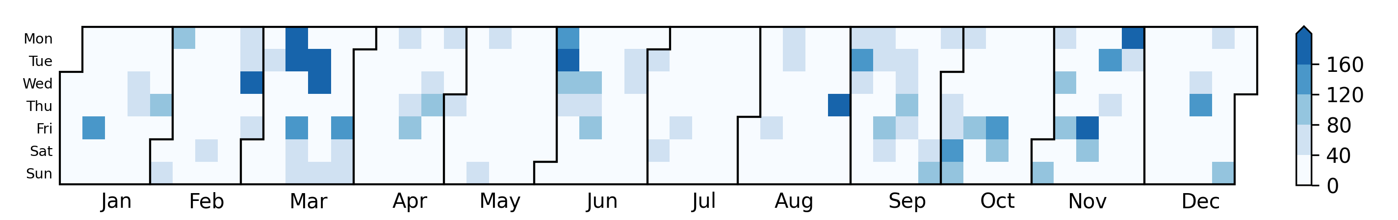
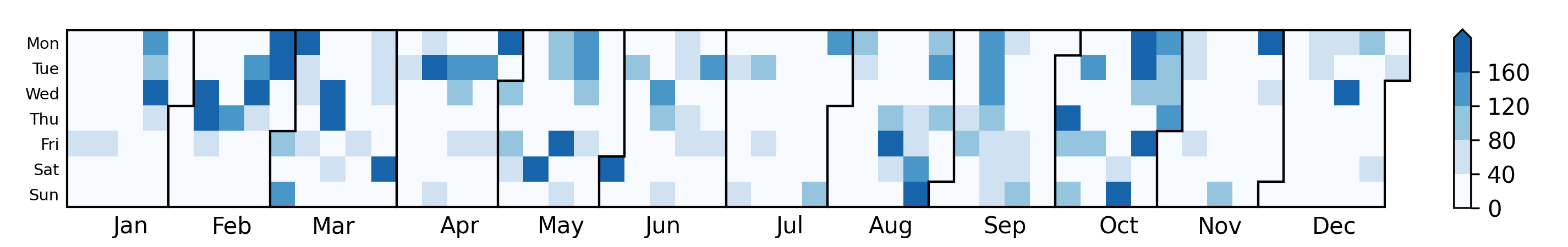
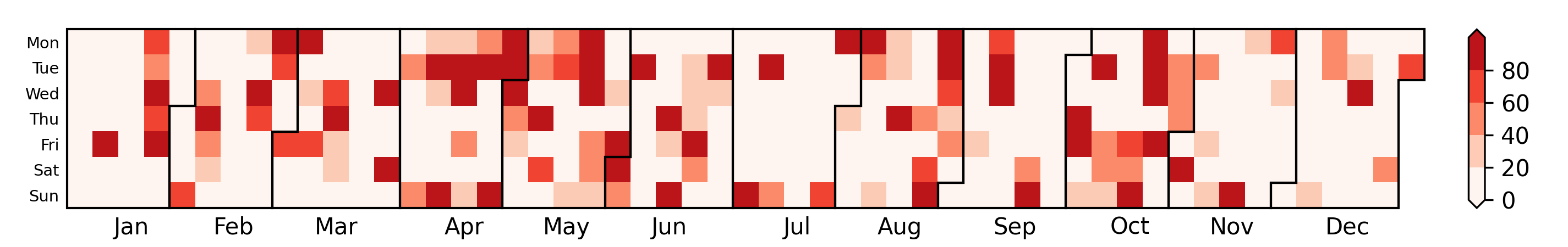
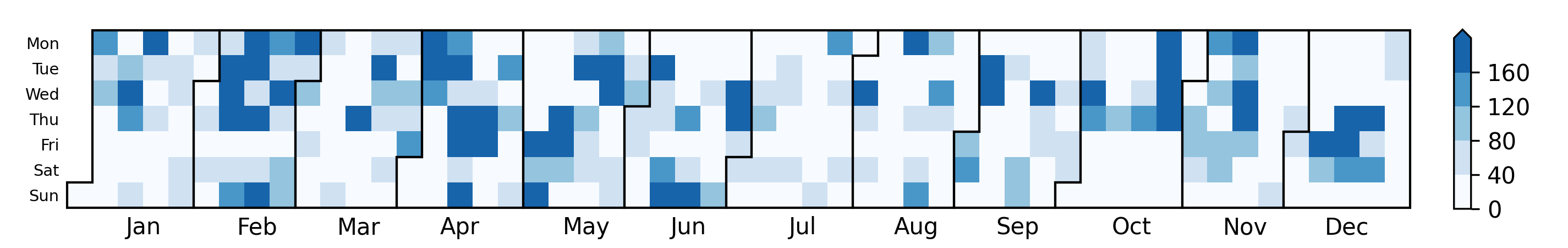
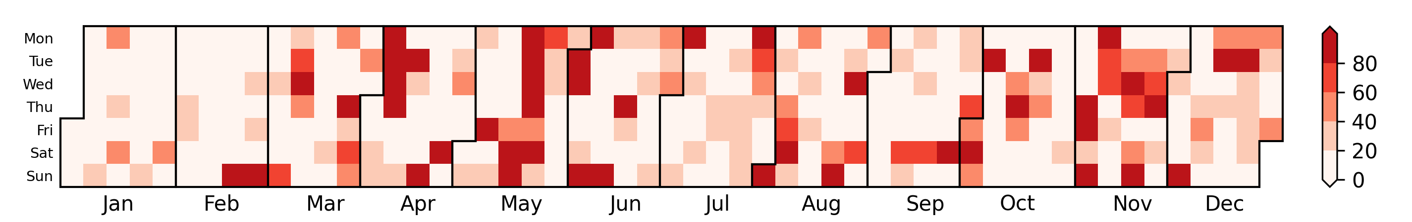
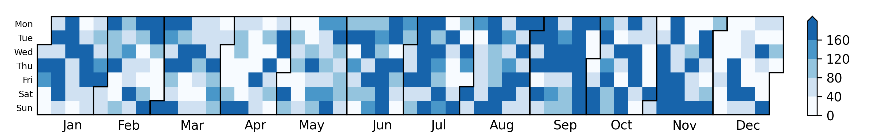
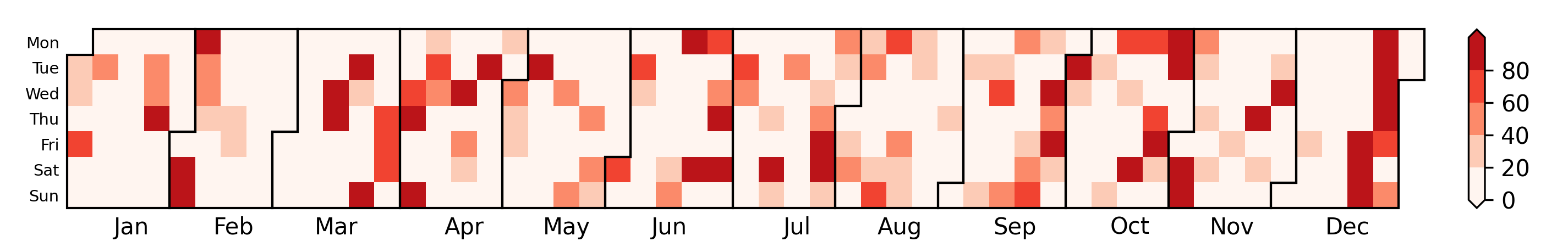
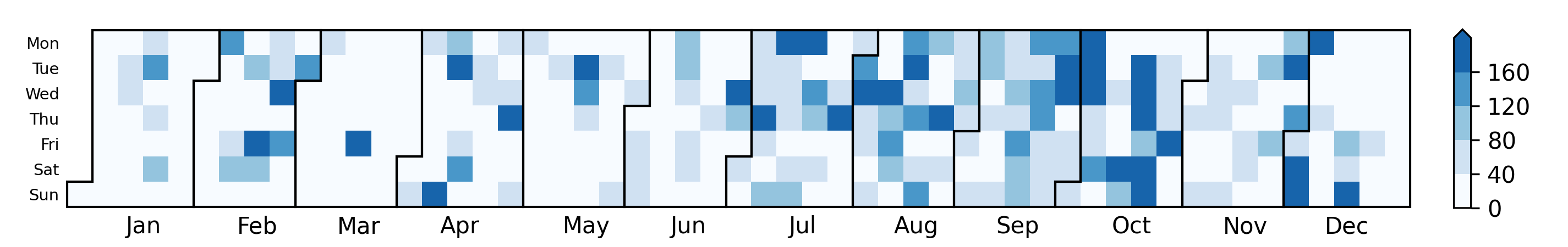
We also assessed the number of unique users for each day. In Figure 6 below, a darker color indicates a larger volume of unique users on that date. The second figure below shows the air quality index (AQI) from four pollutants: ozone (O3), particulate matter (PM2.5 and PM10), carbon monoxide (CO), and sulfur dioxide (SO2). The concentrations of the pollutants were obtained from monitoring stations in Pittsburgh operated by the Allegheny County Health Department. We computed the AQI based on the the EPA guidelines. A darker color in the second figure indicates a higher AQI. The correlation between these two metrics (number of unique users and AQI) was over 0.4 each year since 2017. This indicates that air quality was a moderately important driver of user engagement.
Number of unique users by date (2022)
Air quality index by date (2022)
Number of unique users by date (2021)
Air quality index by date (2021)
Number of unique users by date (2020)

Air quality index by date (2020)
Number of unique users by date (2019)
Air quality index by date (2019)
Number of unique users by date (2018)

Air quality index by date (2018)
Number of unique users by date (2017)
Air quality index by date (2017)
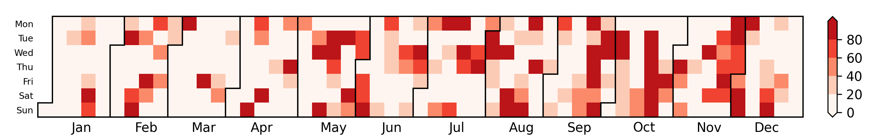
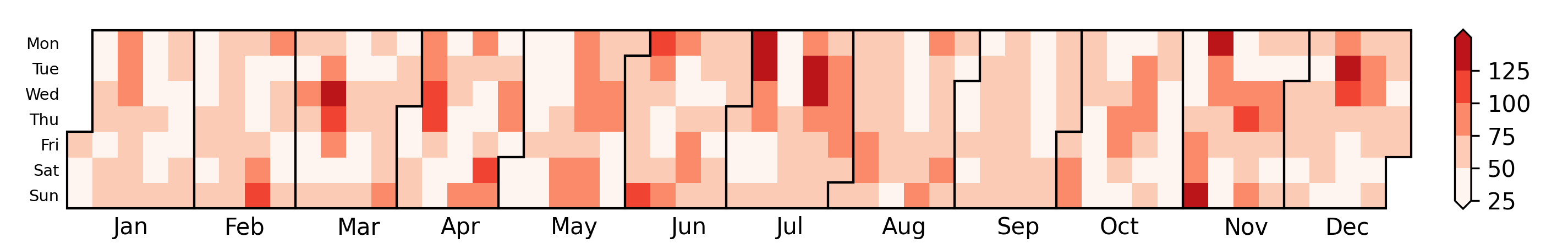
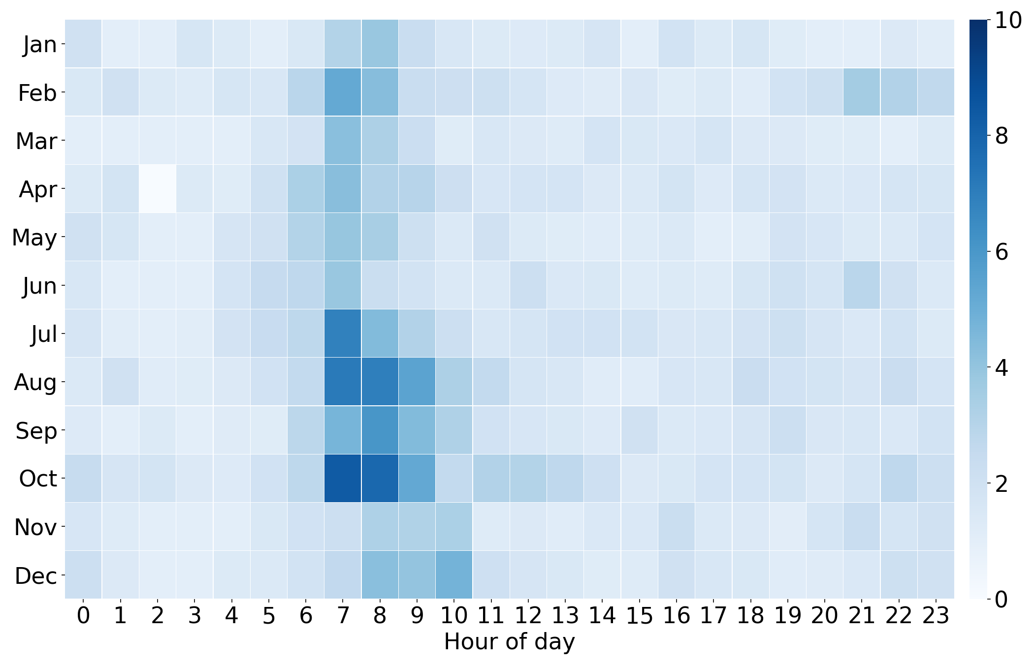
Distribution of Smell Reports Aggregated by Time
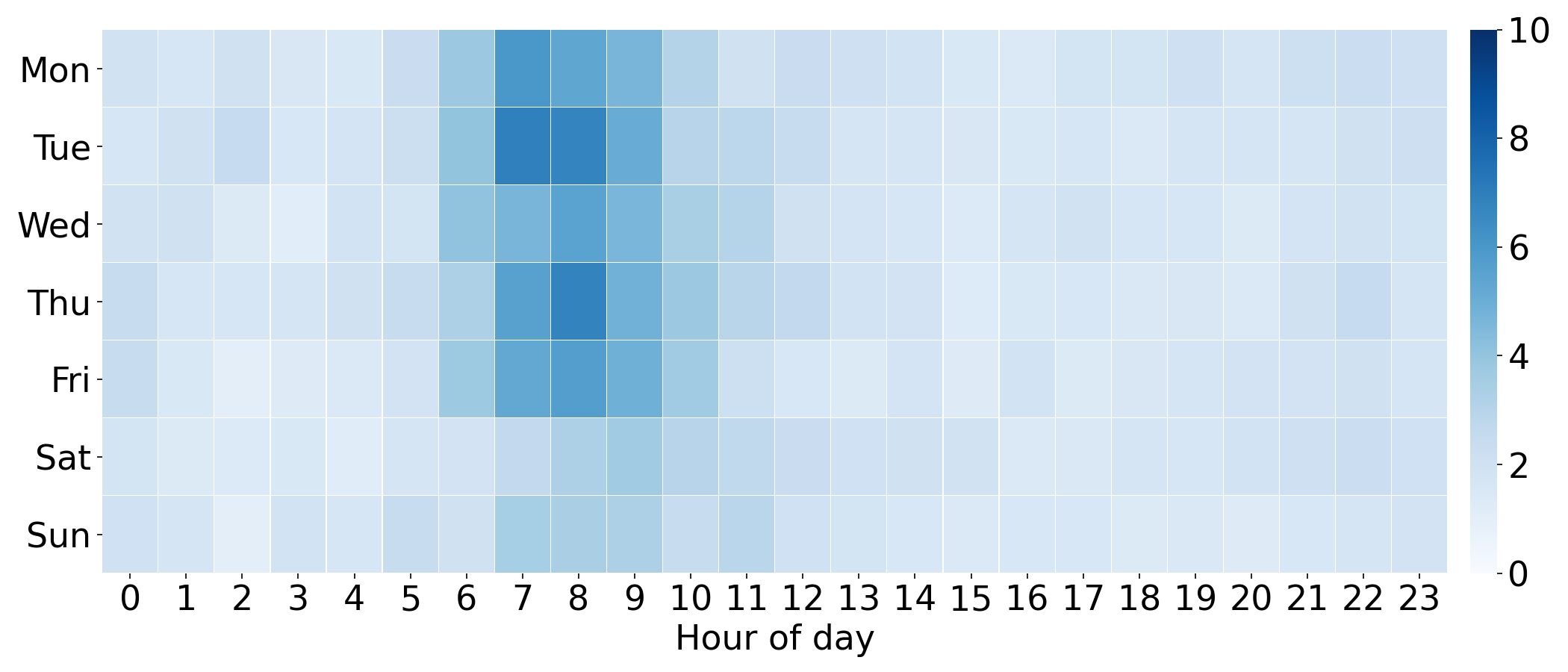
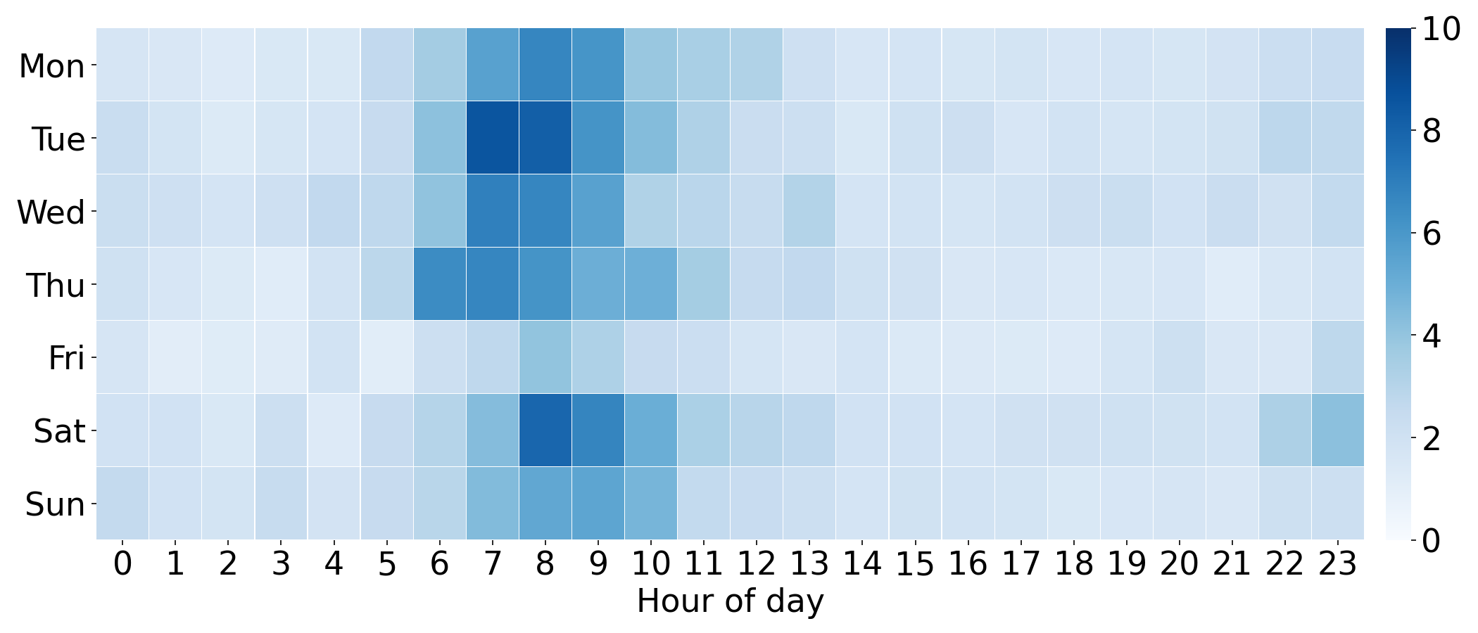
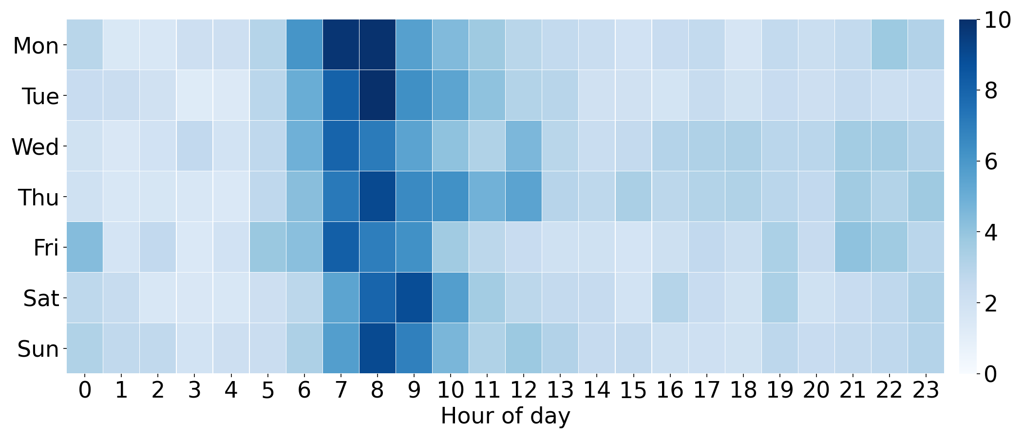
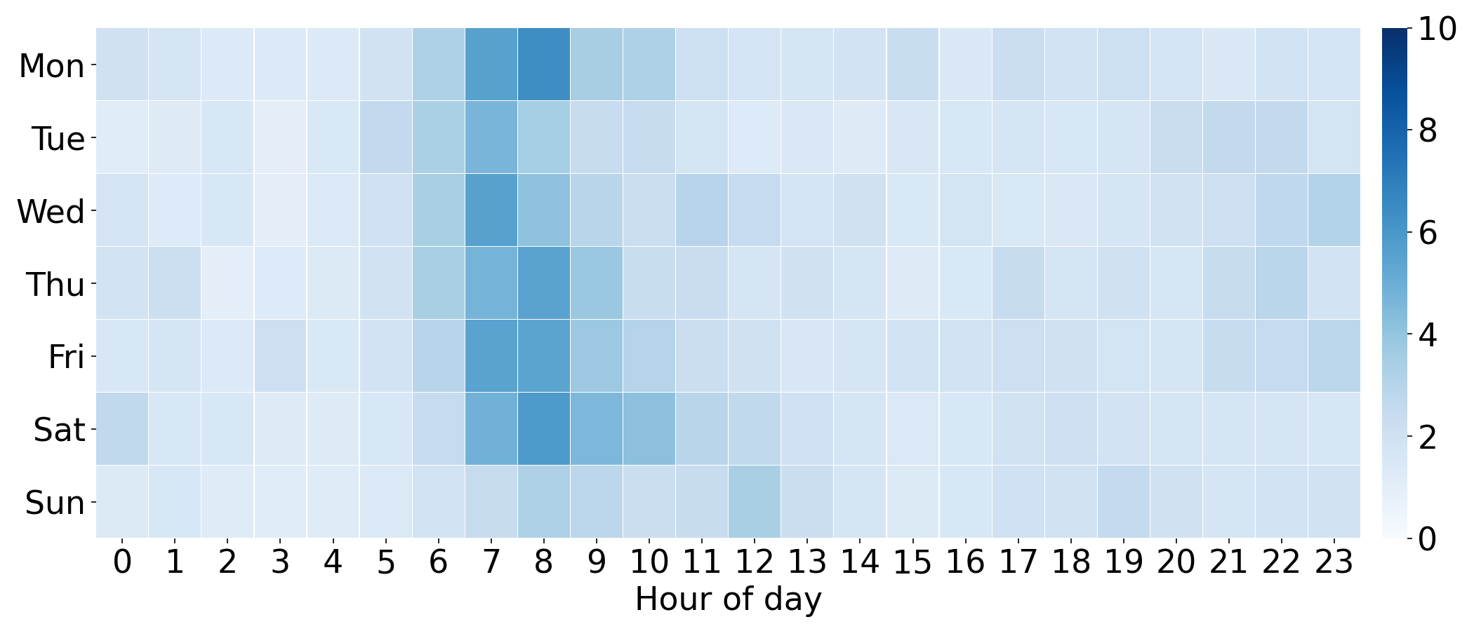
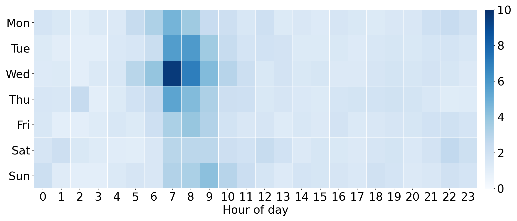
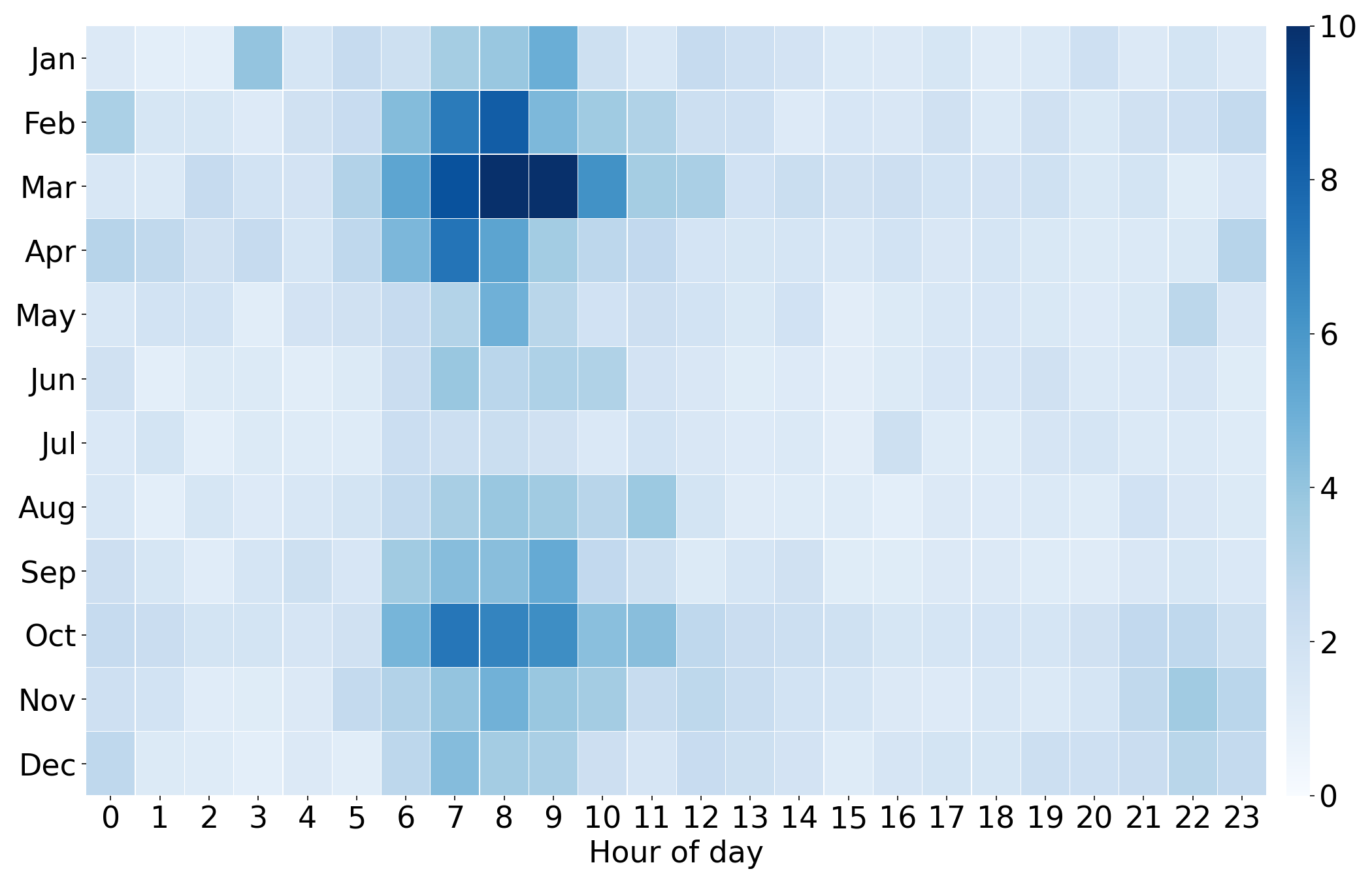
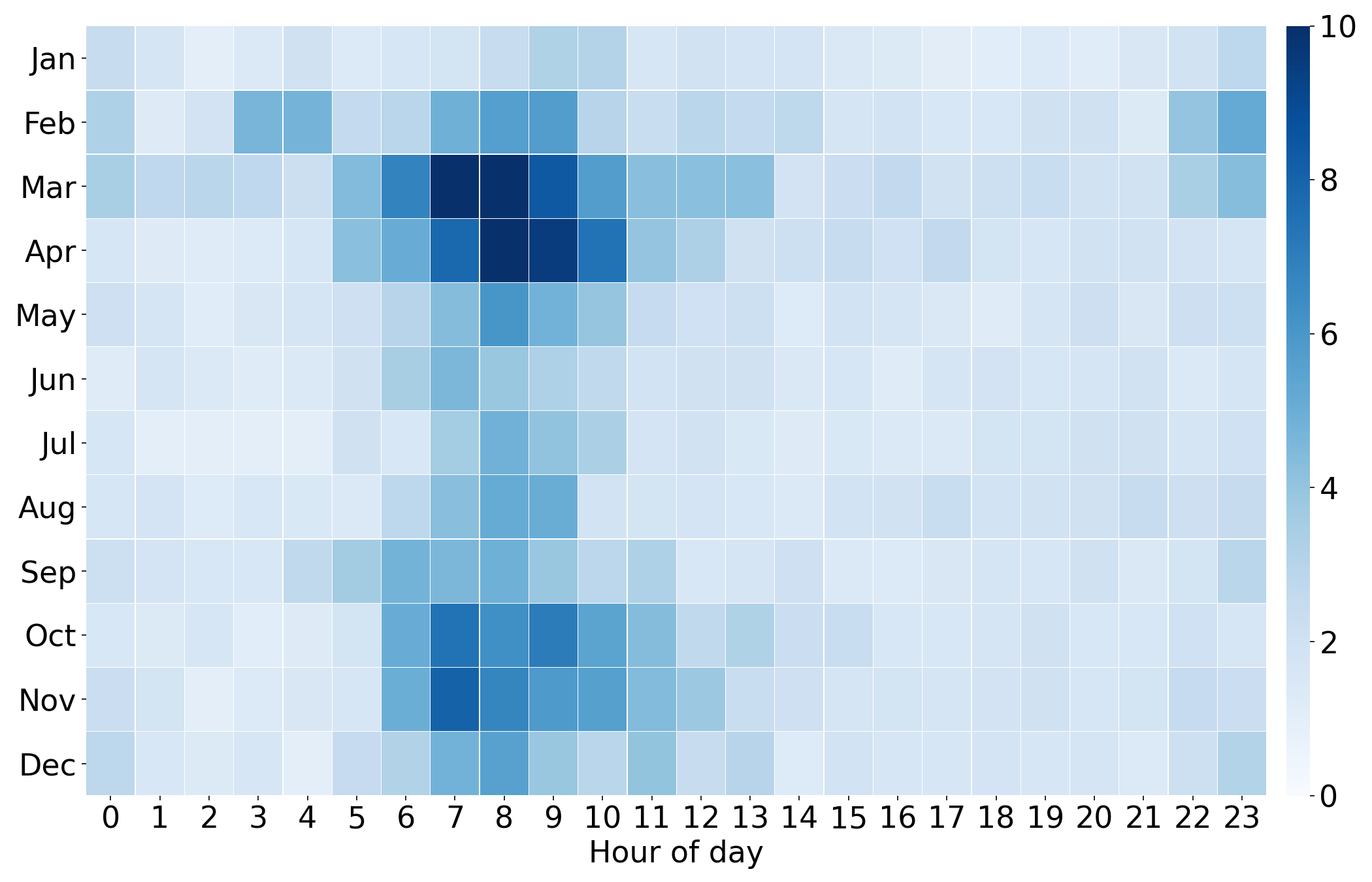
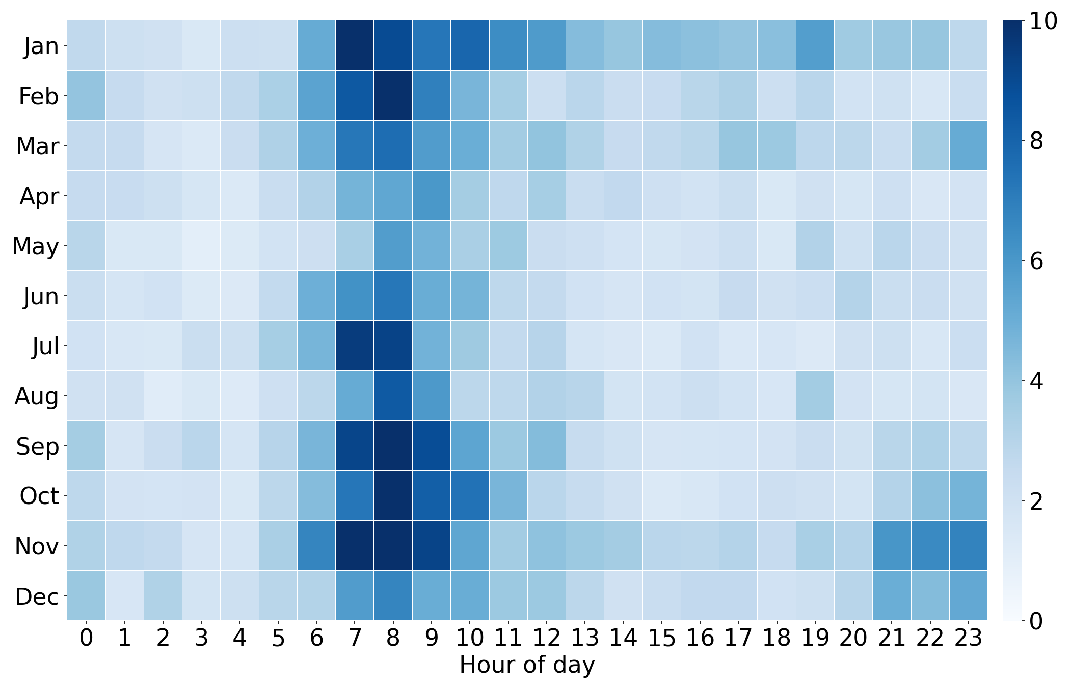
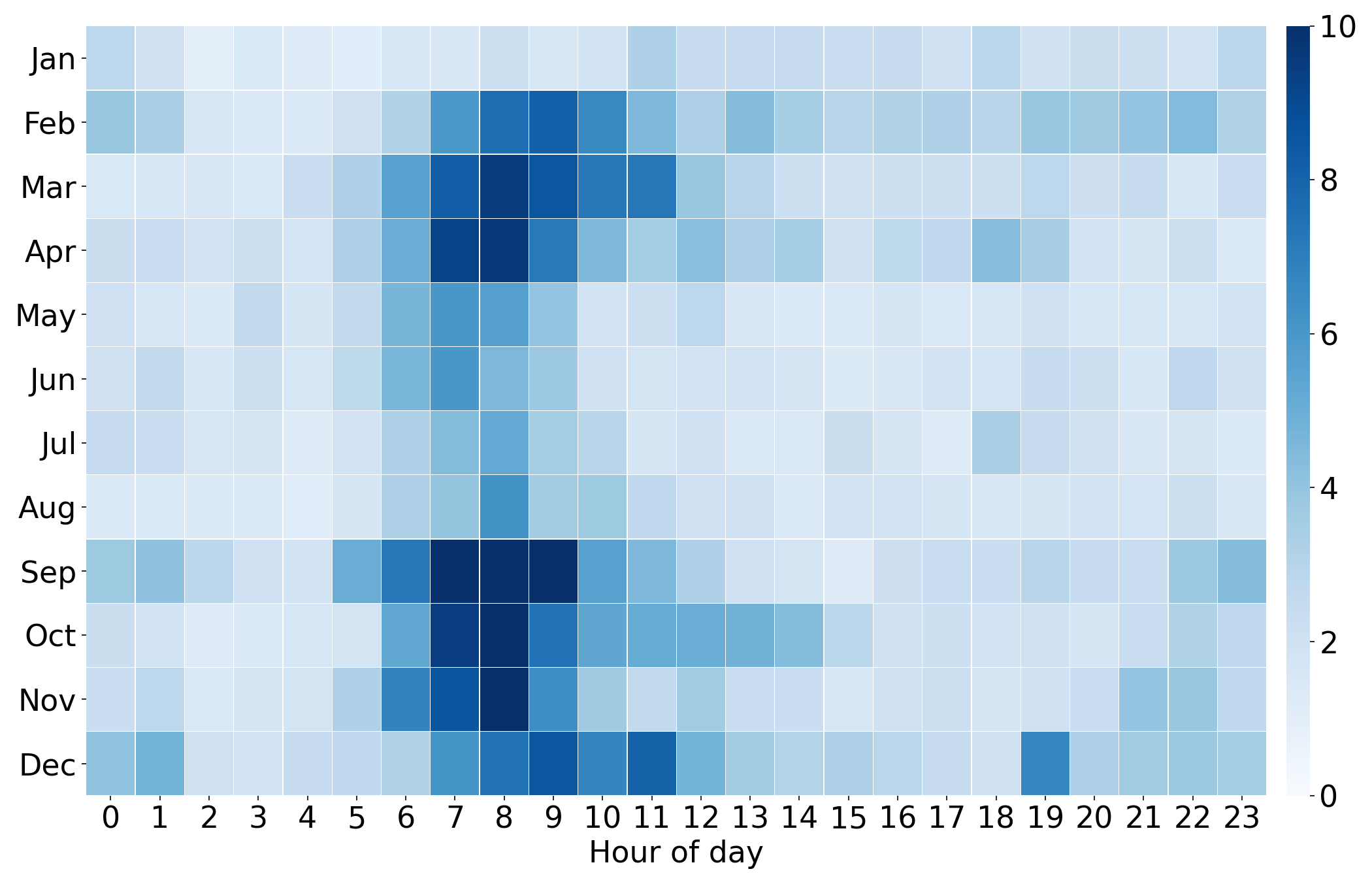
To investigate the concentration of smell reports across time, we computed the average number of smell reports per day, aggregated by hour of day and day of week. The following figure (Figure 7) shows that most reports were submitted during morning hours (especially between 7 and 10am), and less frequently at nighttime. Distribution of report submissions was fairly even across days of the week in 2019 and 2020, while reports from earlier years were more concentrated on weekdays compared to weekends.
Average number of reports per day (2022)
Average number of reports per day (2021)
Average number of reports per day (2020)
Average number of reports per day (2019)

Average number of reports per day (2018)
Average number of reports per day (2017)
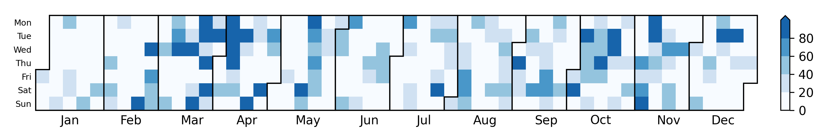
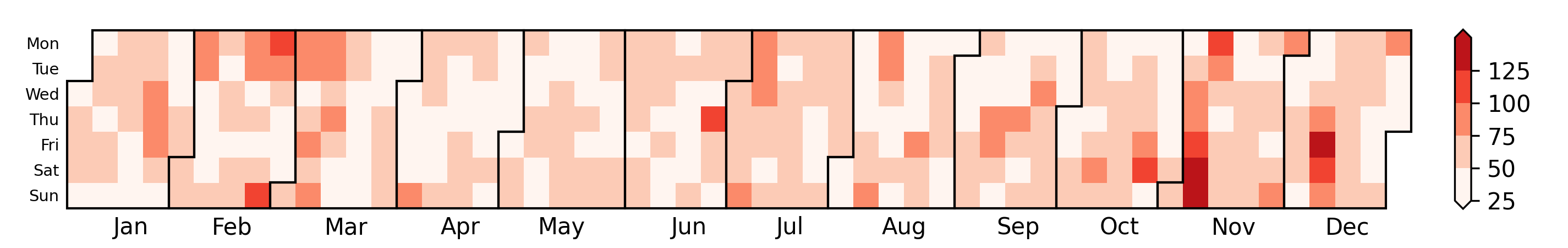
Moreover, we computed the average number of smell reports per day, aggregated by hour of day and month (see Figure 8). Reports were disparately distributed across the different months, which indicates different pollution and engagement patterns.
Average number of reports per day (2022)
Average number of reports per day (2021)
Average number of reports per day (2020)
Average number of reports per day (2019)
Average number of reports per day (2018)

Average number of reports per day (2017)
Distribution of Smell Reports Aggregated by Region
The following maps (Figure 9) show the distribution of smell reports by Pittsburgh area zip codes across several years. A darker color indicates more reports in an area. Note that this map indicates citizen engagement with the Smell PGH app, but does not necessarily represent the severity of pollution in that region. In general, citizen engagement increased over the years, especially from 2018 to 2019.
Number of smell reports by zip codes (2025)
Number of smell reports by zip codes (2024)
Number of smell reports by zip codes (2023)
Number of smell reports by zip codes (2022)
Number of smell reports by zip codes (2021)
Number of smell reports by zip codes (2020)
Number of smell reports by zip codes (2019)
Number of smell reports by zip codes (2018)
Number of smell reports by zip codes (2017)
Also, the number of our users increased over the years in Pittsburgh. The following maps (Figure 10) show the distribution of unique users by Pittsburgh area zip codes across the years. A darker color indicates more unique users in an area.
Number of unique users by zipcodes (2022)
Number of unique users by zipcodes (2021)
Number of unique users by zipcodes (2020)
Number of unique users by zipcodes (2019)
Number of unique users by zipcodes (2018)
Number of unique users by zipcodes (2017)
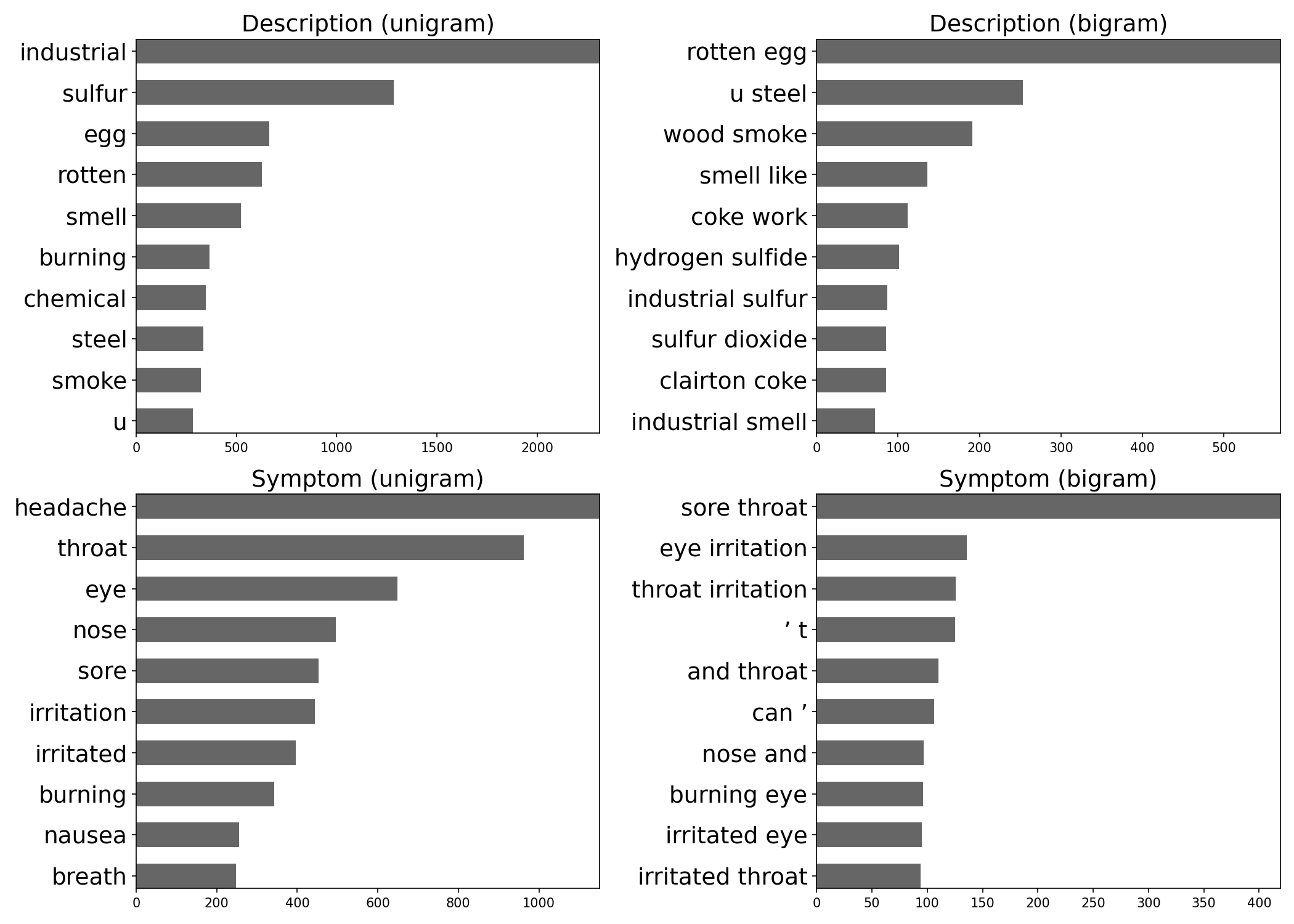
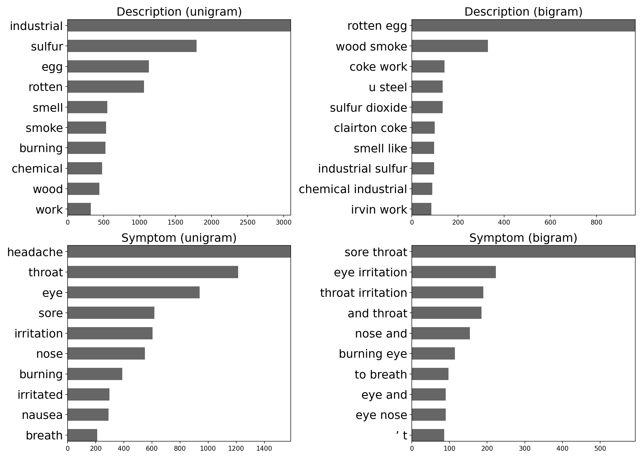
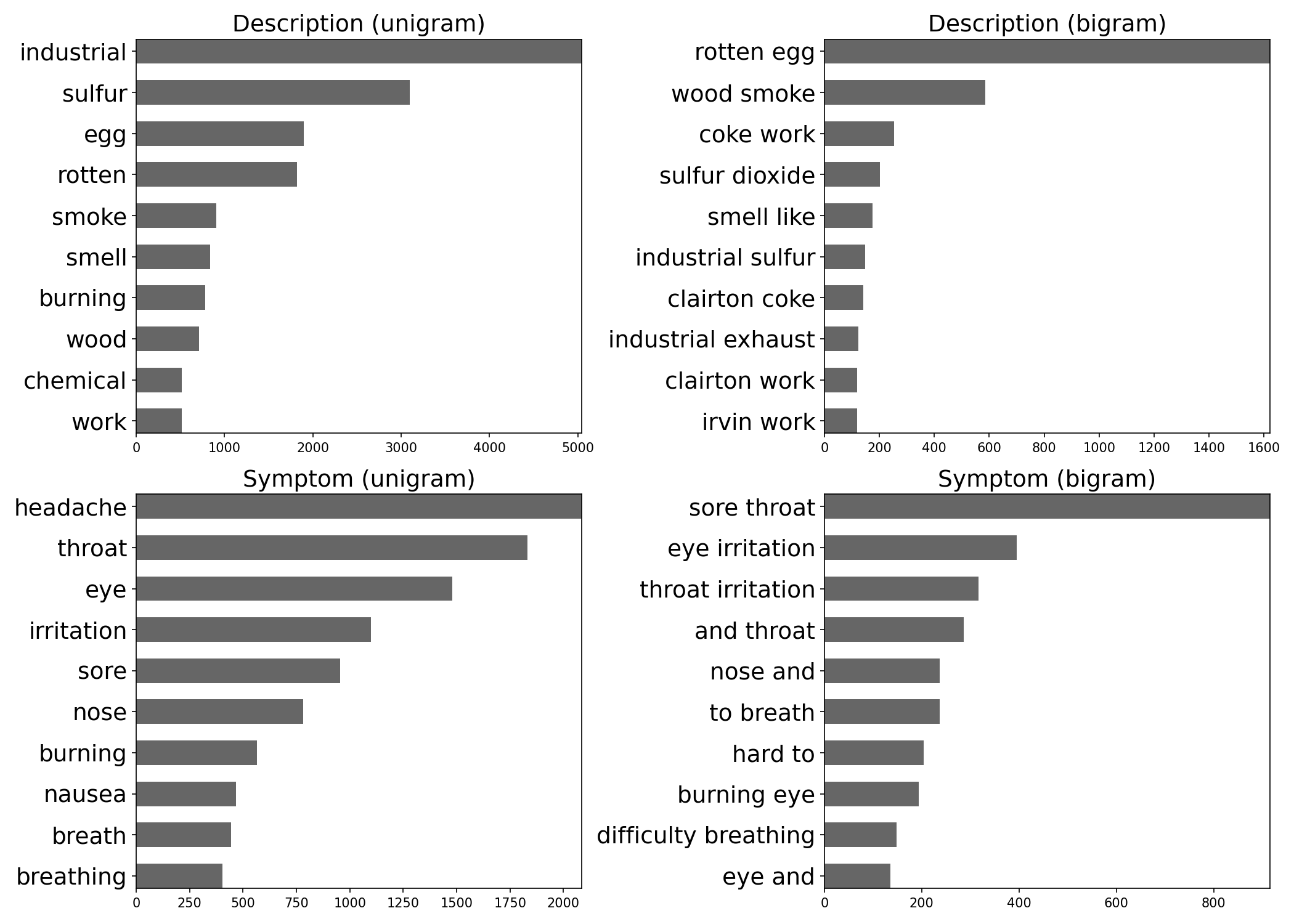
Content Analysis of Smell Reports
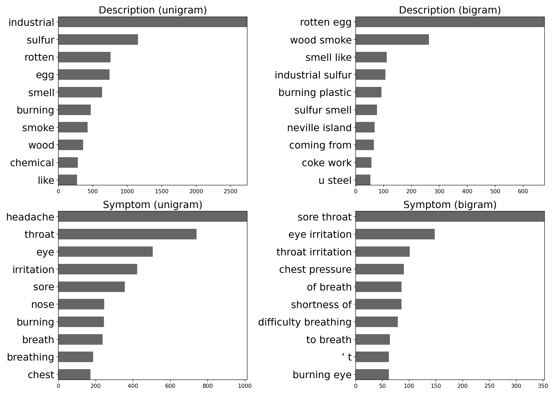
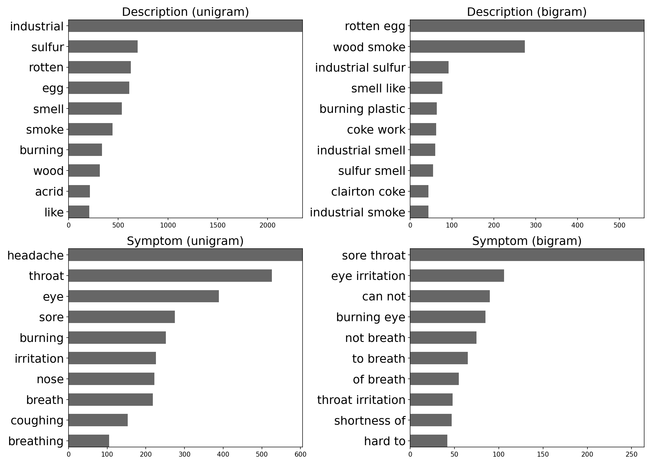
To identify critical topics in citizen-contributed smell reports, we analyzed the frequency of words (unigram) and phrases (bigram) in the text fields. Figure 11 (below) shows that the majority of user comments described industrial pollution odors and symptoms related to air pollution exposure. Odor descriptions and symptoms were frequently linked to hydrogen sulfide, which has a "rotten egg" smell and is known to cause symptoms of headaches, dizziness, eye irritation, sore throat, cough, nausea, and shortness of breath (Reiffenstein et al., 1992; Guidotti, 2010).
Content analysis (2022)
Content analysis (2021)
Content analysis (2020)
Content analysis (2019)

Content analysis (2018)
Content analysis (2017)
Relationship between Smell Reports and Pollutants
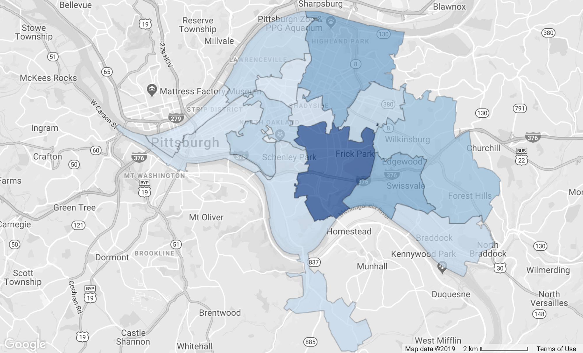
Comments from Smell PGH users and Pittsburgh community members suggested that hydrogen sulfide might be the primary source of pollution odors in the area. We took the smell reports from the following highlighted Pittsburgh regions (Figure 12) to analyze the relationship between smell, wind, and hydrogen sulfide.
We used statistical methods to analyze the relationship between a subset of smell reports and hydrogen sulfide concentrations, as measured by county monitors in the region. The figure below (Figure 13) shows the result for 23 months of data (10/31/2016 to 9/27/2018). Note that this identified relationship does not imply causation.
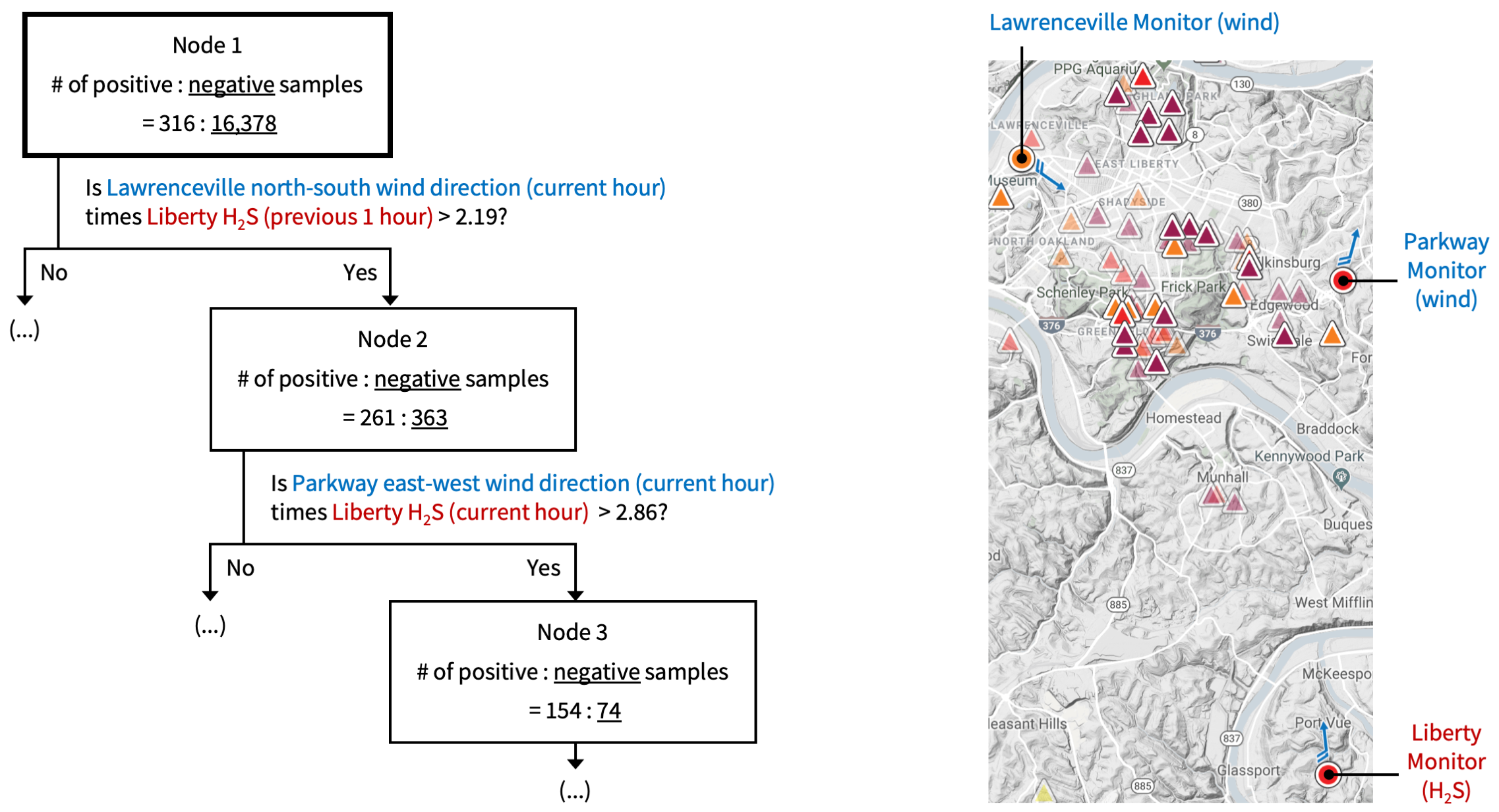
The decision tree (Quinlan, 1986) depicted above is analogous to how a medical doctor may diagnose a patient. The top level of the tree shows the most influential predictor, which is the interaction between wind direction at the Lawrenceville monitoring station and hydrogen sulfide concentration at the Liberty monitoring station. The Allegheny County Health Department operates these monitoring stations. Based on this finding, we investigated this relationship further, by date.
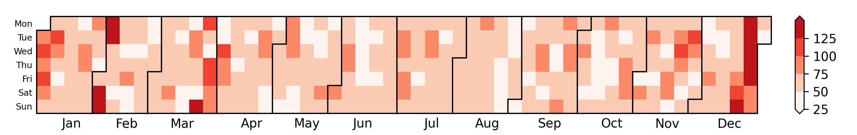
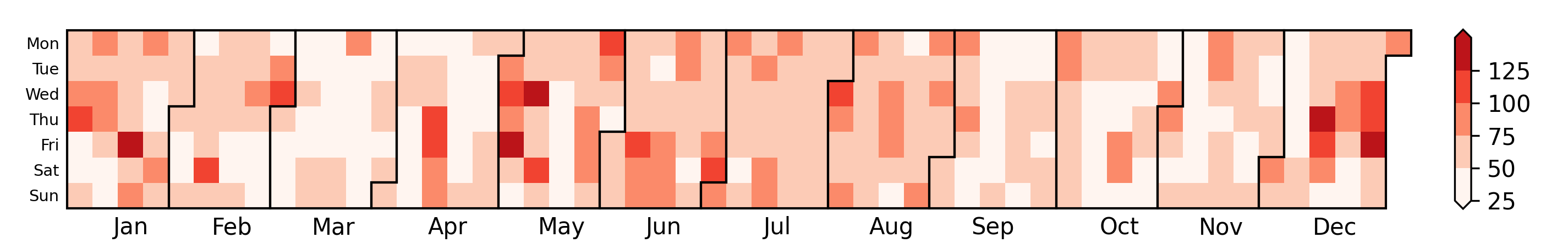
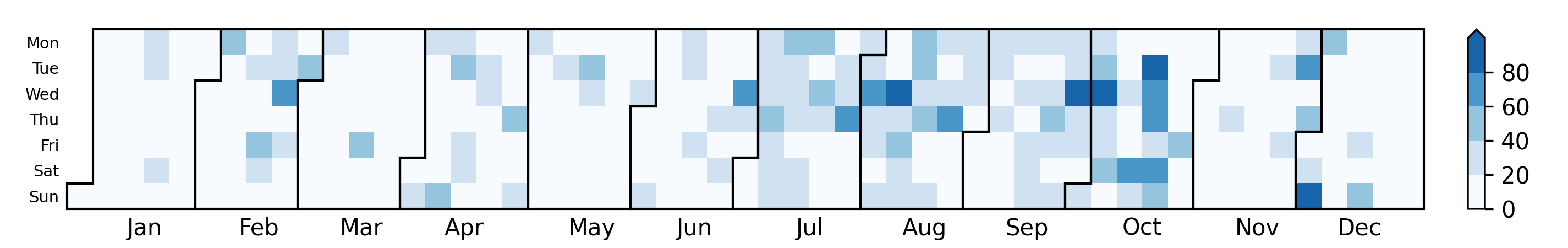
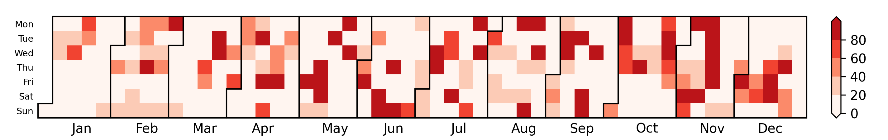
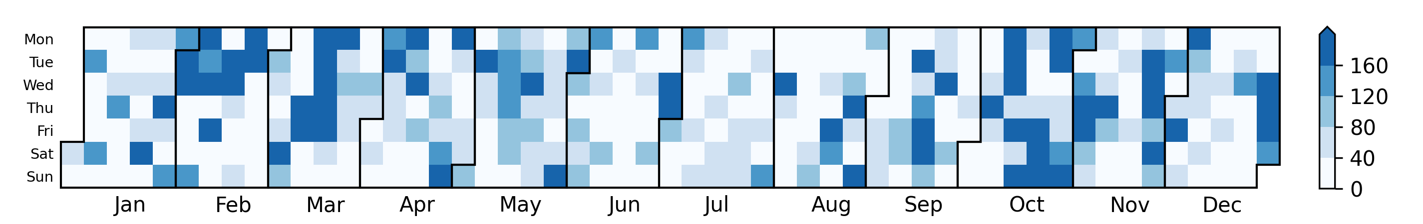
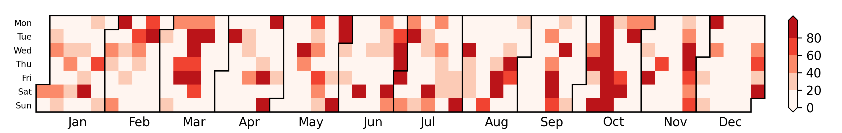
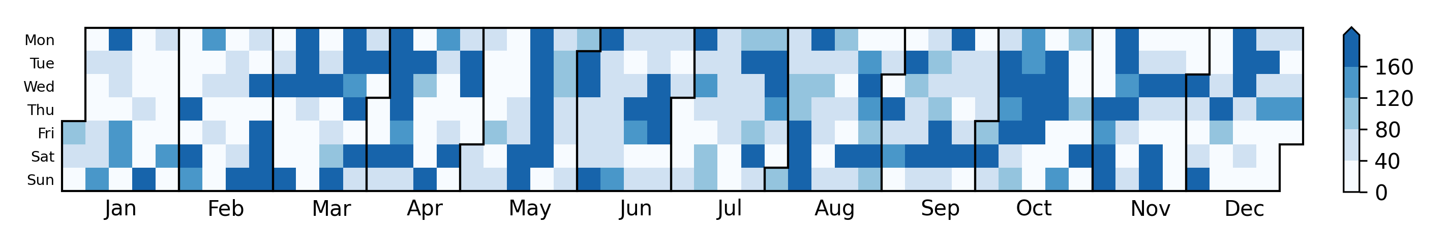
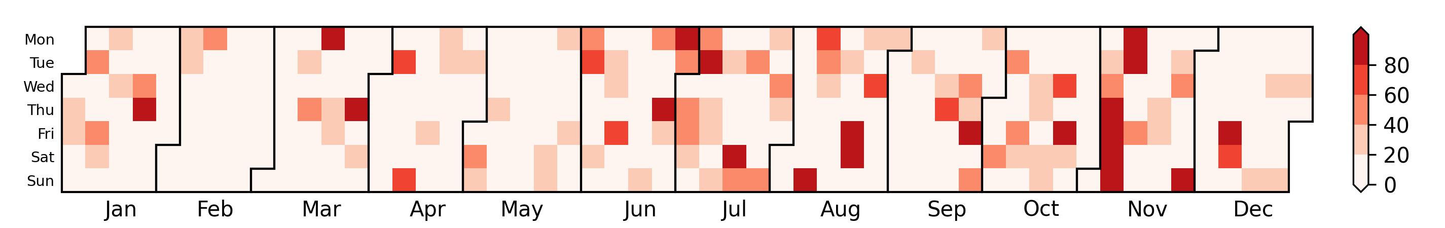
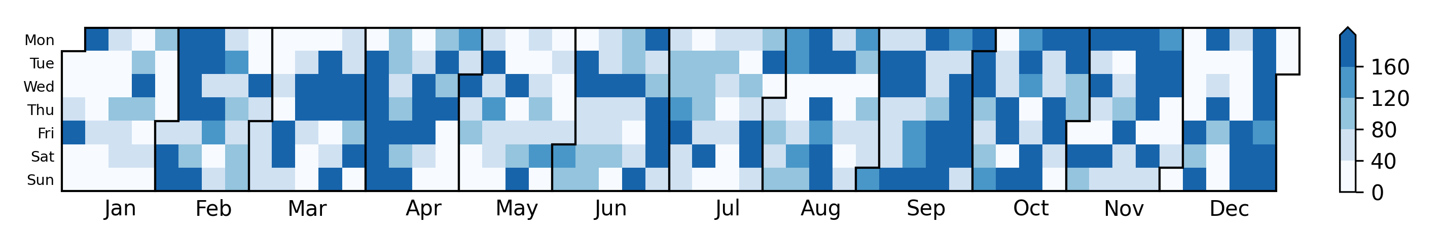
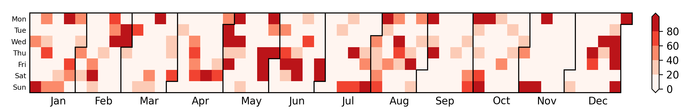
We compared two metrics that are related to smell reports and data from county air quality monitors, respectively. The first metric shows the sum of smell ratings for each day, excluding reports with ratings that are less than three. A darker color indicates a larger volume of smell reports on that date (see Figure 14). The second metric shows the maximum concentration of hydrogen sulfide per day, weighted by the contributions of the wind directions (from the south and the east) at both the Parkway and Liberty monitoring stations. The formula for each hourly measurement is:
where represents the concentration of hydrogen sulfide in parts per billion (ppb) of the Liberty monitoring station,
is the wind direction at the Liberty monitoring station,
and
is the wind direction at the Parkway monitoring station.
A darker color in the second metric indicates a larger concentration of hydrogen sulfide in the area (see Figure 14).
The correlation between these two metrics (the sum of smell ratings and the maximum weighted concentration of hydrogen sulfide per day) was over 0.5 in each of the years.
This indicates that hydrogen sulfide was a significant driver of smell reports.
Sum of smell ratings by date (2025)
Maximum of weighted hydrogen sulfide concentration by date (2025)

Sum of smell ratings by date (2024)
Maximum of weighted hydrogen sulfide concentration by date (2024)
Sum of smell ratings by date (2023)
Maximum of weighted hydrogen sulfide concentration by date (2023)
Sum of smell ratings by date (2022)
Maximum of weighted hydrogen sulfide concentration by date (2022)
Sum of smell ratings by date (2021)
Maximum of weighted hydrogen sulfide concentration by date (2021)
Sum of smell ratings by date (2020)
Maximum of weighted hydrogen sulfide concentration by date (2020)
Sum of smell ratings by date (2019)
Maximum of weighted hydrogen sulfide concentration by date (2019)
Sum of smell ratings by date (2018)

Maximum of weighted hydrogen sulfide concentration by date (2018)
Sum of smell ratings by date (2017)
Maximum of weighted hydrogen sulfide concentration by date (2017)